Responsive Design
Responsive design is easy in Oxygen thanks to the various responsive design features.
Breakpoints
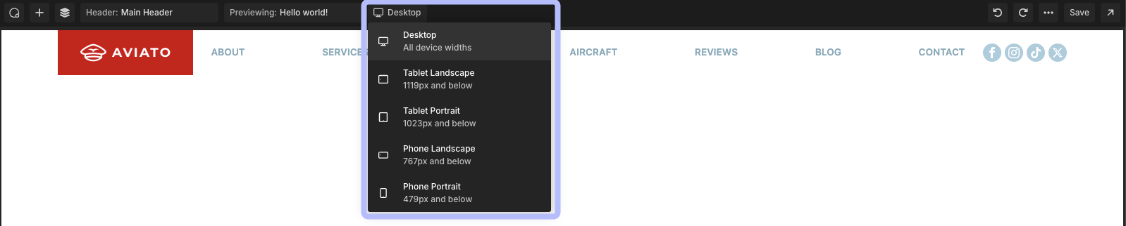
Viewport widths or device sizes are often referred to as breakpoints in web design & development. Oxygen includes 5 breakpoints by default:
- Desktop: All device widths
- Tablet Landscape: 1119px and below
- Tablet Portrait: 1023px and below
- Phone Landscape: 767px and below
- Phone Portrait: 479px and below
Each of these breakpoints has been chosen based on various devices and their screen sizes that people use.
While it is not possible to adjust these breakpoints, you can create your own breakpoints if your site needs them.
Previewing Your Design At Smaller Widths
To preview your design at a specific breakpoint, click the breakpoints dropdown near the top middle of the Top Bar.
There, you’ll find a number of default breakpoints to choose from. If you’ve designated any custom breakpoints, they’ll appear as well.
By choosing a breakpoint, Oxygen’s Canvas will adjust its size to the size of that breakpoint, allowing you to see how your design will look at various viewport widths.
Changing Styles On Specific Breakpoints
If a style needs to be adjusted at a certain breakpoint, you can do that by selecting the appropriate breakpoint from the Top Bar, and then making the necessary changes in the Properties panel for the element.
If an element has a Design tab, such as the Post Loop Builder element, you may also change breakpoints by hovering over certain controls and then using the breakpoint selector next to the control.
Hiding Elements On Specific Breakpoints
If you want to hide an element only on specific breakpoints, you can do that by selecting the appropriate breakpoint from the Top Bar. Then, set the element’s class to display: none.